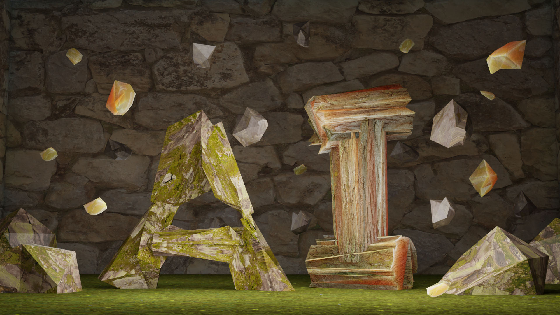
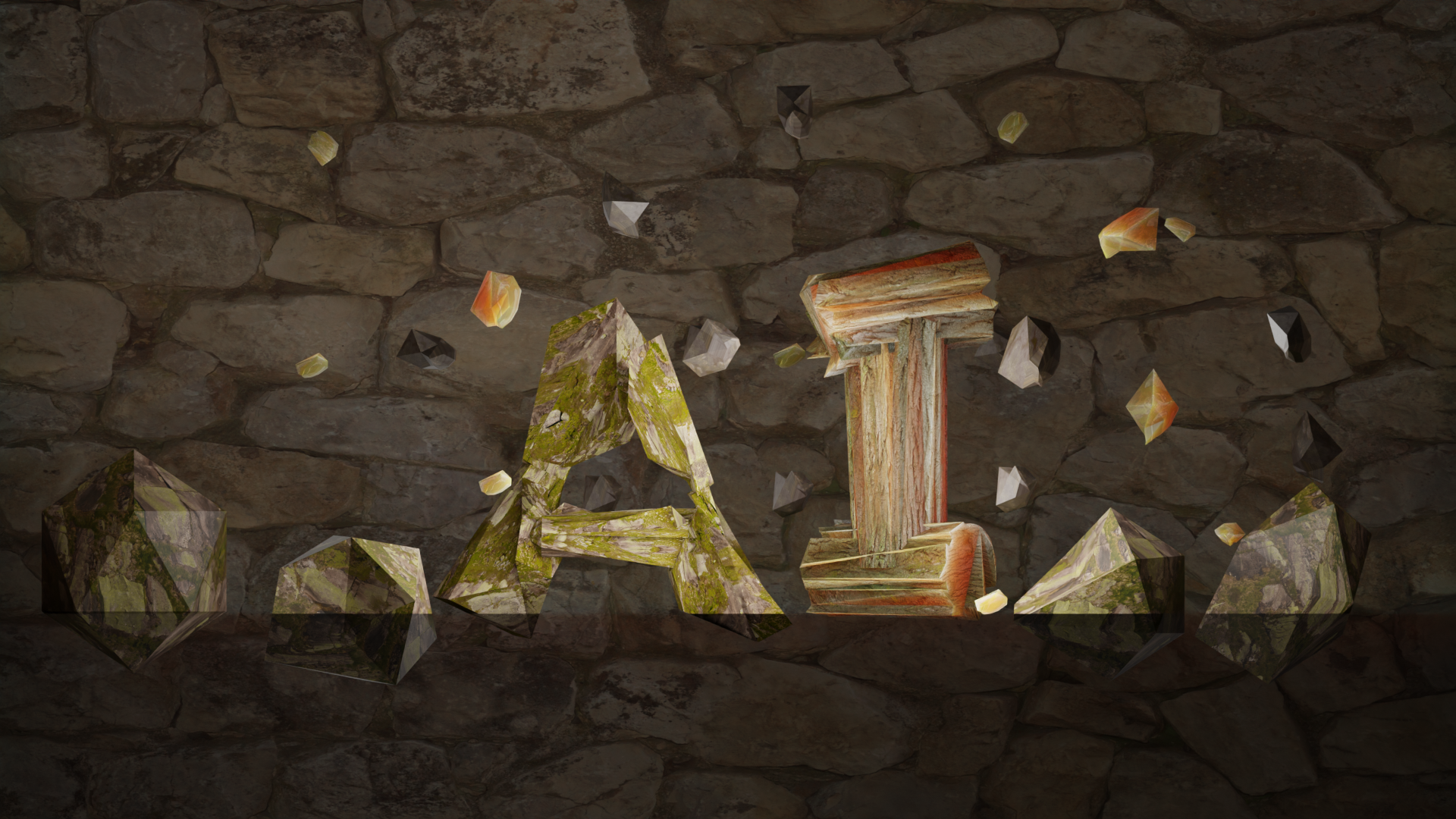
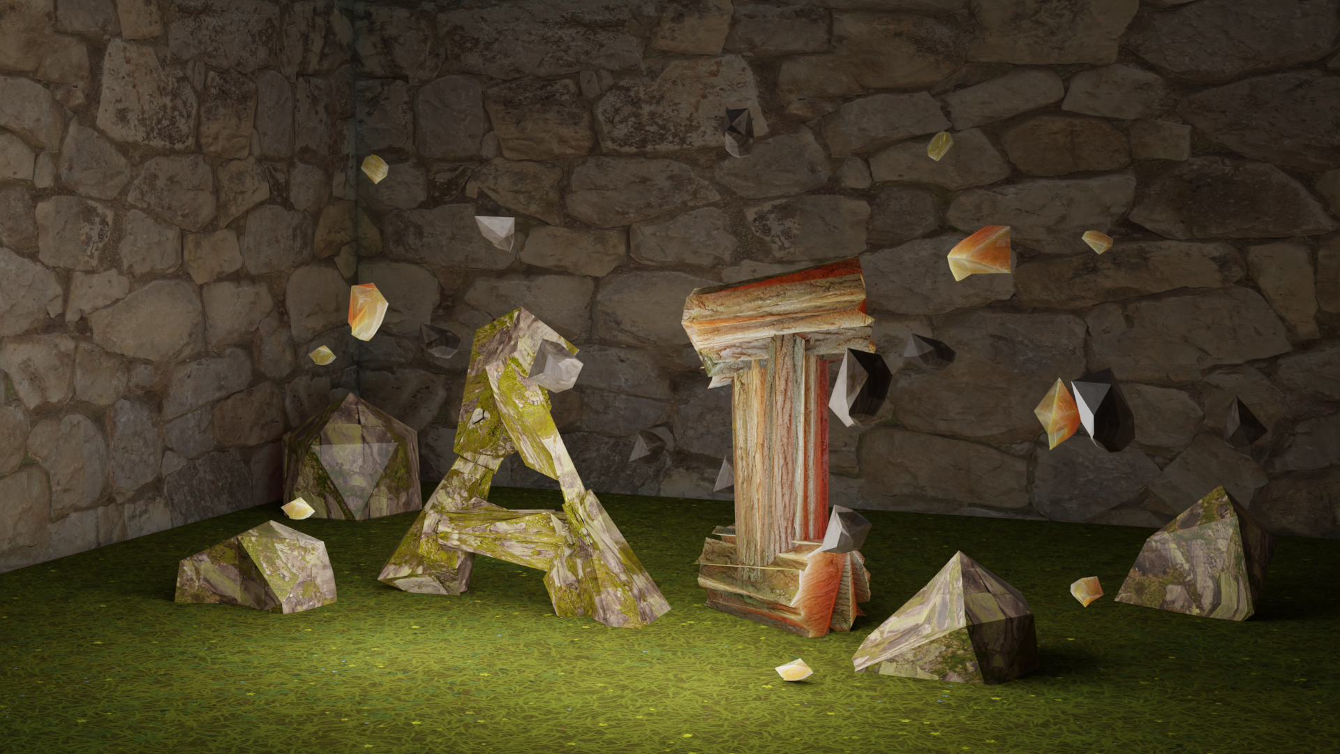
a-irony, front view
The concept: AI + Nature = irony = a-irony.
Brief
In this project, we were assigned to use Blender, a popular 3D software, to design two uppercase letterforms, each with a unique material and texture. We were tasked with fully rendering them using specific camera and lighting conditions.
composition details
Creative Process
Background
For this 3D letter project, I have taken two contradictory topics (nature and AI or technology) and paired them together in order to create an ironic, dramatic, and thought-provoking composition. It revolves around the irony of:
• calling man-made things “natural”
• natural elements spelling “AI”
• nature looking polished, out of place, man-made...
• natural elements spelling “AI”
• nature looking polished, out of place, man-made...
The composition is based on nature, yet replaces realism with dramatic chaos, and makes the viewer wonder...
Will our own future look like this?

Mind mapping ideas
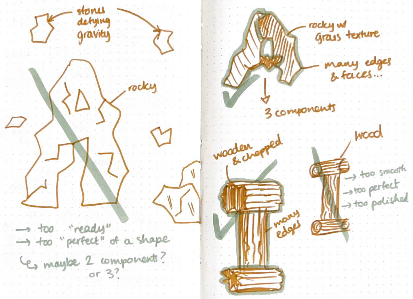
Preliminary sketches
Design Process
How to approach this project? In a perfectly imperfect way.
The goal: to make the viewer feel immersed and intrigued by:
• modifying and “breaking” traditional shapes
• combining earthy elements and technological artificiality
• including dramatic lighting
• excluding gravity
• placing everything in a compact and blocky space
• combining earthy elements and technological artificiality
• including dramatic lighting
• excluding gravity
• placing everything in a compact and blocky space
Are you interested?
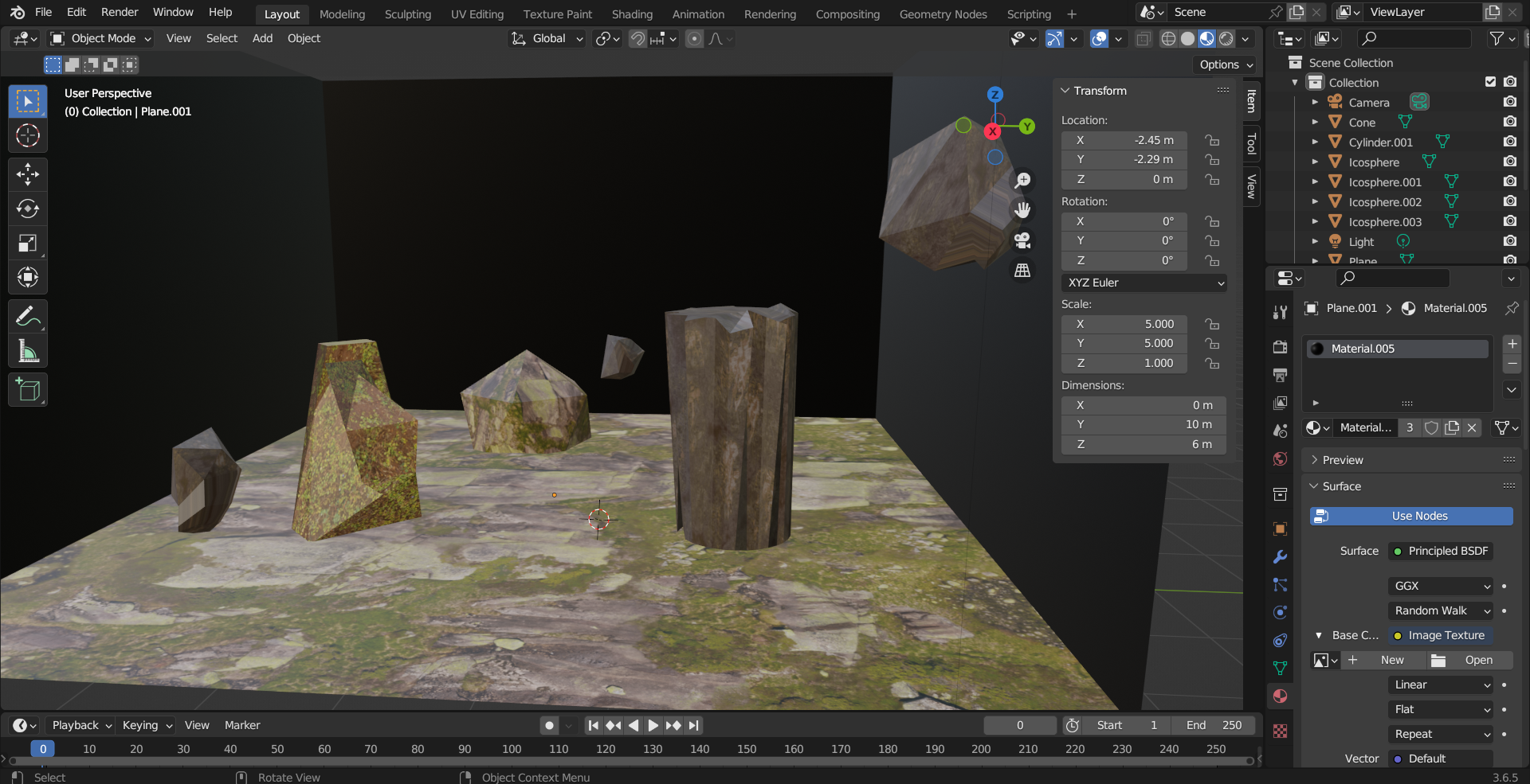
Work in progress
Work in progress
Challenges
The main challenge was getting acquainted with Blender, as it was the only class in which we used the software. I took the time to experiment with modeling, texturing, lighting, and camera angles to better understand its capabilities and bring the concept to life.
Final Outcome
Favorite Details
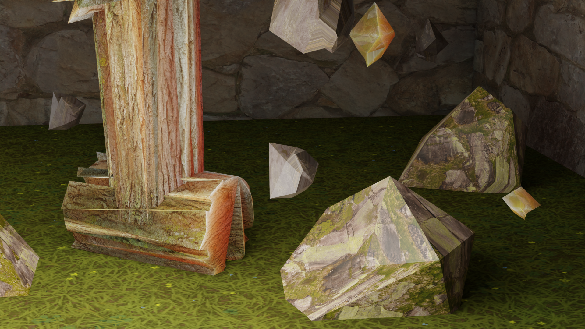
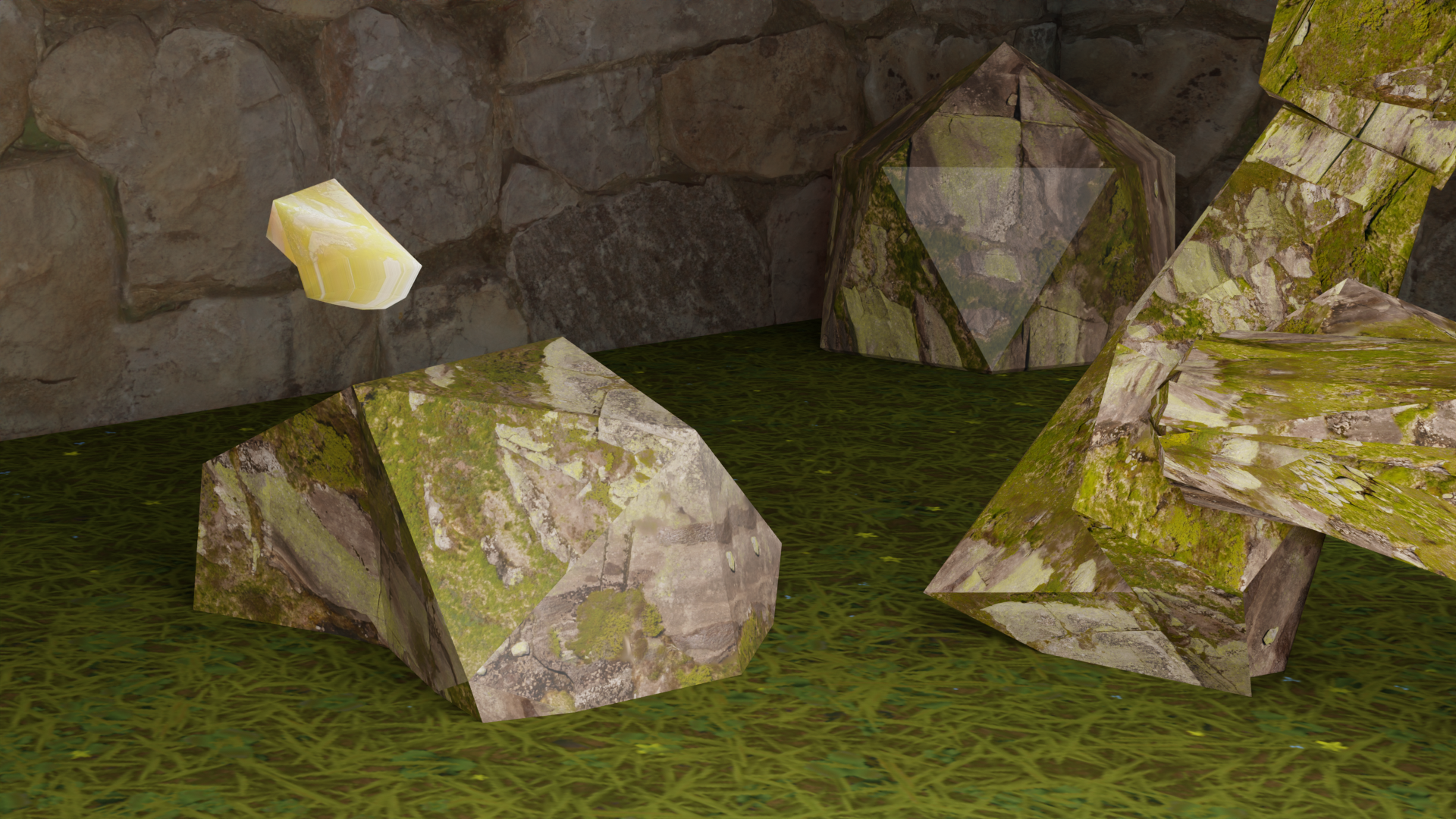
Some unique features of this project include the creative use of light, spatial composition, and the abstract formation of the letters A and I. Five distinct textures, assigned to the letter A, the letter I, the floating rocks, the walls, and the ground, create a striking contrast that enhances the visual impact and depth of the piece.
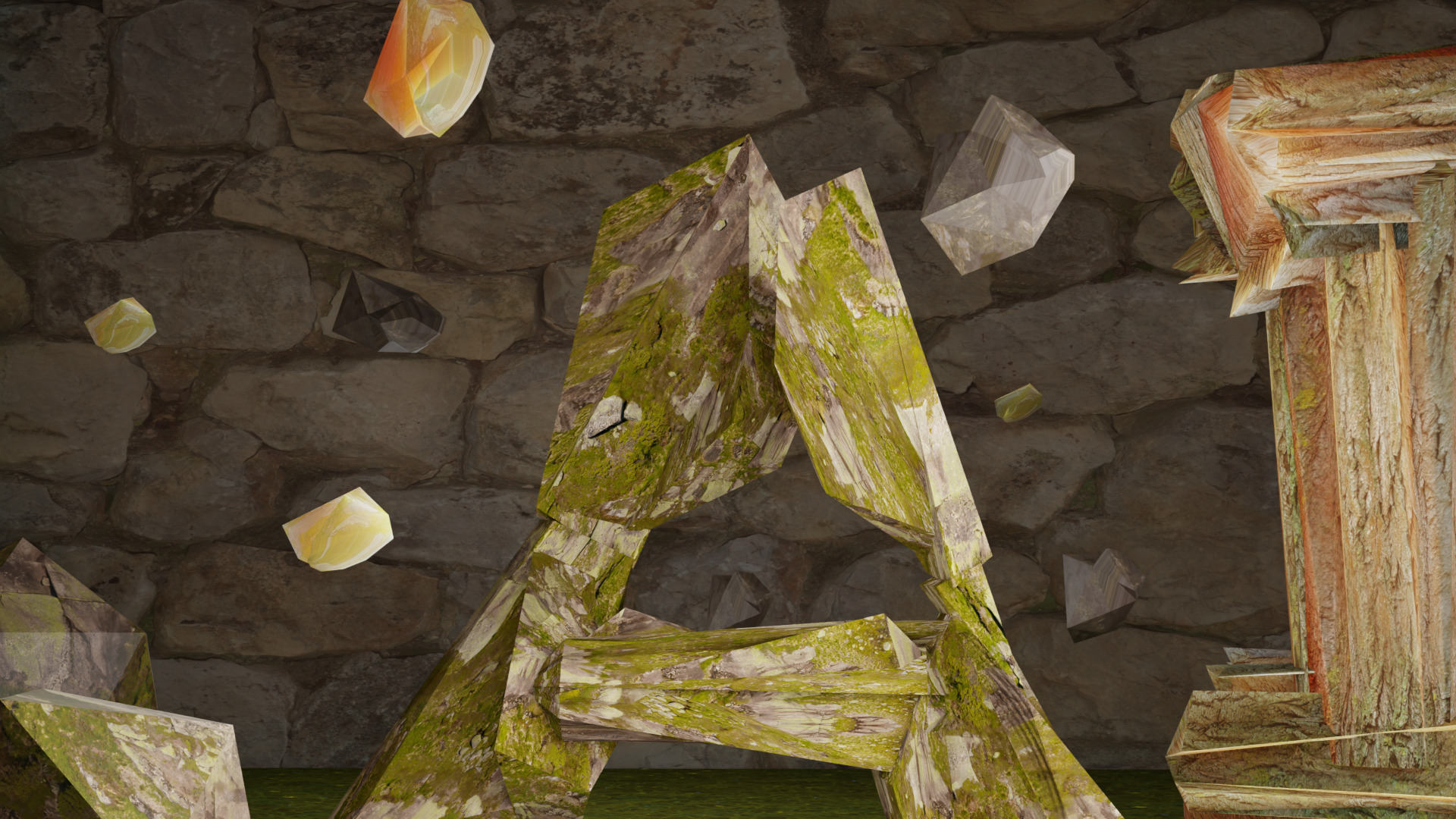
Composition details
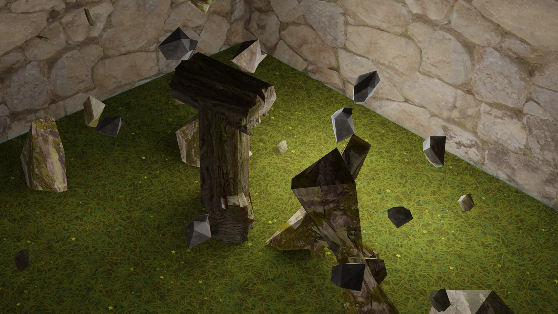
Isometric view, back

Composition details
Orthographic view
Composition details
Lessons Learned
This project taught me to trust the process and not shy away from fully exploring an idea. Though the concept felt abstract and bold at first, seeing it through showed me the value of committing to a vision.
Isometric view, front
Future Paths
A possible continuation of this project would be designing a new typeface featuring 3D letterforms inspired by natural elements, organic textures, and imperfect shapes, further exploring the relationship between nature and digital design.