
Poster 1
The Athens Book Fair project consists in the branding of the Athens Book Fair event through a logotype and an identity reflected in 5 posters aiming to make the viewer want to read more books. I have chosen to achieve this goal through a calming and welcoming scenery promoting a category of books for each poster, with the catchphrase "There's a book for that".

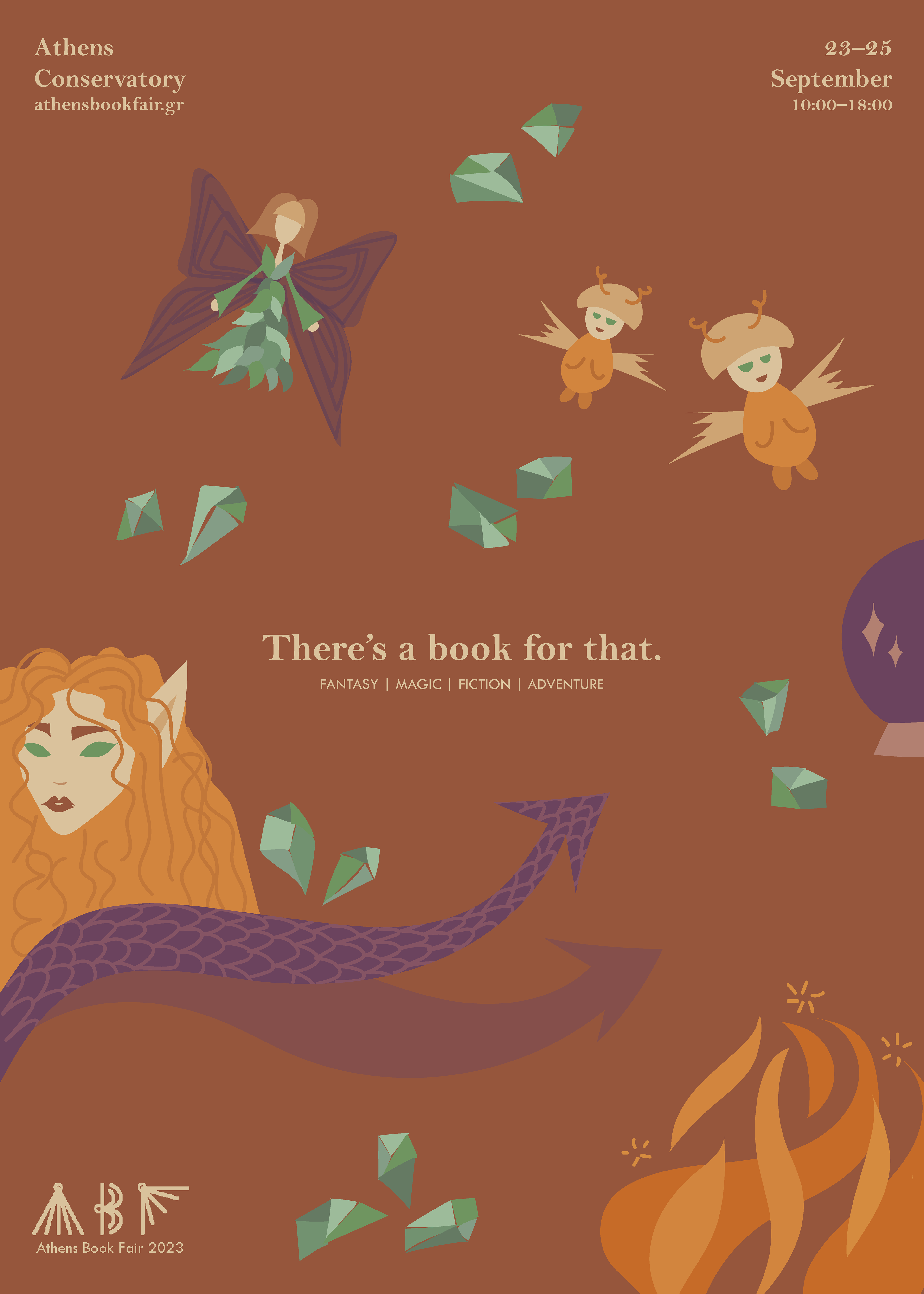
Poster 2 work in progress
Brief
The brief consists in luring the viewer to the reading world and therefore to the Athens Book Fair through the creation of a series of 5 posters having as common element the means through which the viewer will be persuaded.
Creative Process
Background
I had started developing my illustration style when this project got assigned, and being an avid reader of all genres, I decided to depict the sceneries I picture when thinking of different books through a serene, friendly, almost familiar illustration style.
Design Thinking
The calming scenery is made possible through a warm and muted color palette of earthy tones, mainly:
• green – calm and positive feelings towards reading
• brown & beige – feelings of safety and serenity
• orange – showing enthusiasm and warmth
• purple – specifically for the last poster (fantasy), as a hint of creativity
Challenges
The main challenge encountered in this project was designing all 5 posters as part of a series, that is, having them harmonize stylistically despite them having different themes.
Poster 1 sketch

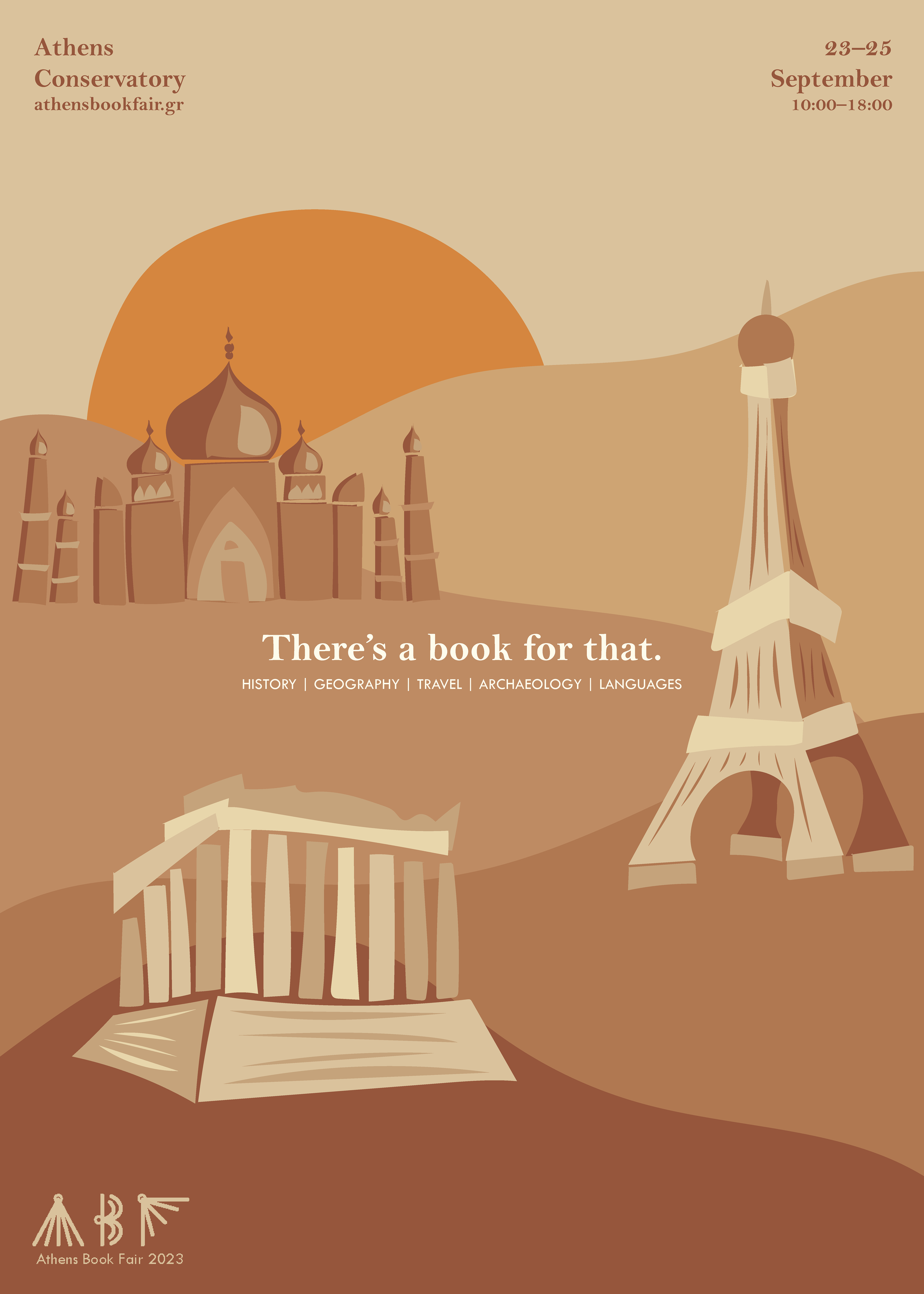
Poster 1

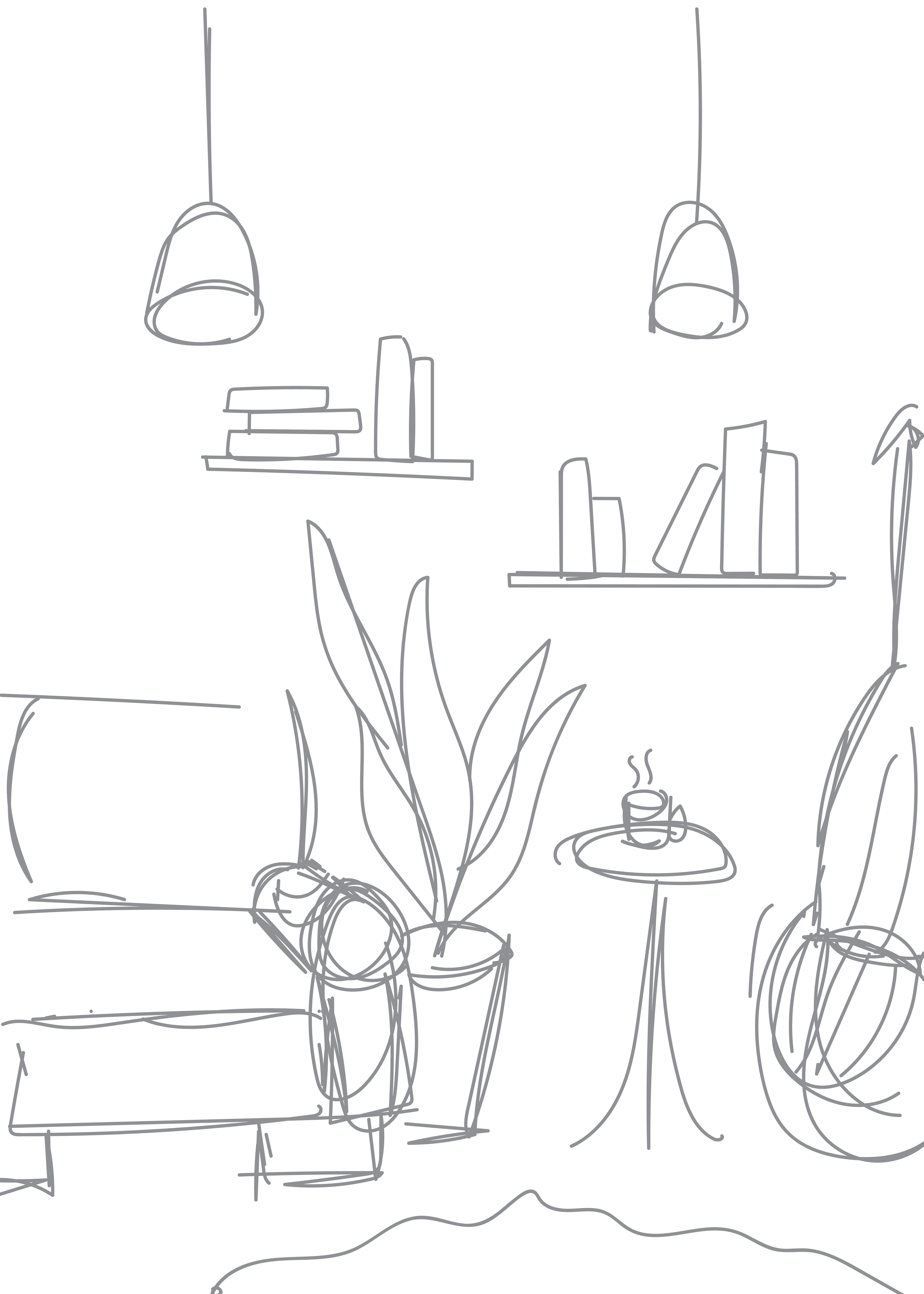
Poster 2 sketch
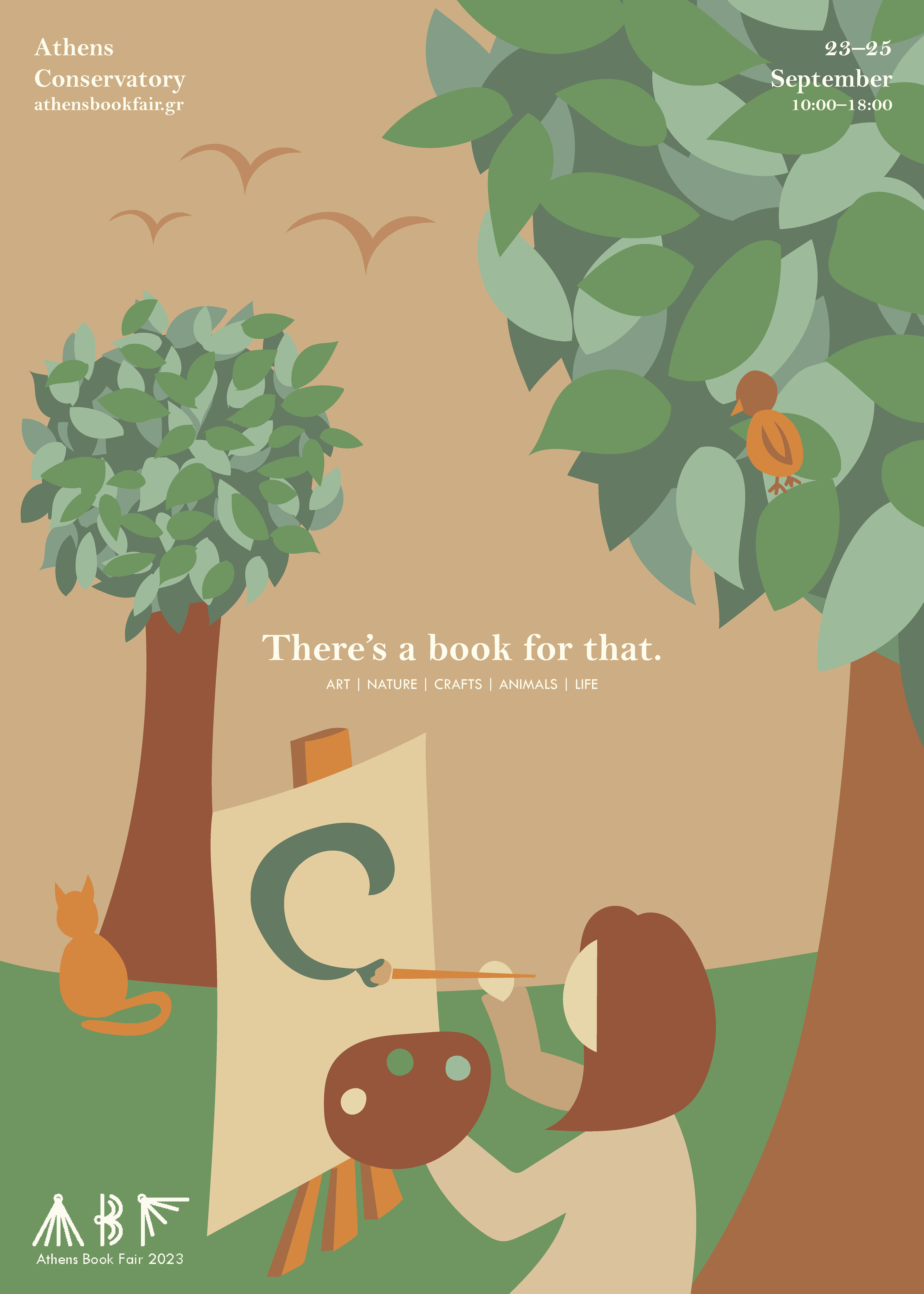
Poster 2

Poster 3 sketch
Poster 3
Poster 4 sketch

Poster 4

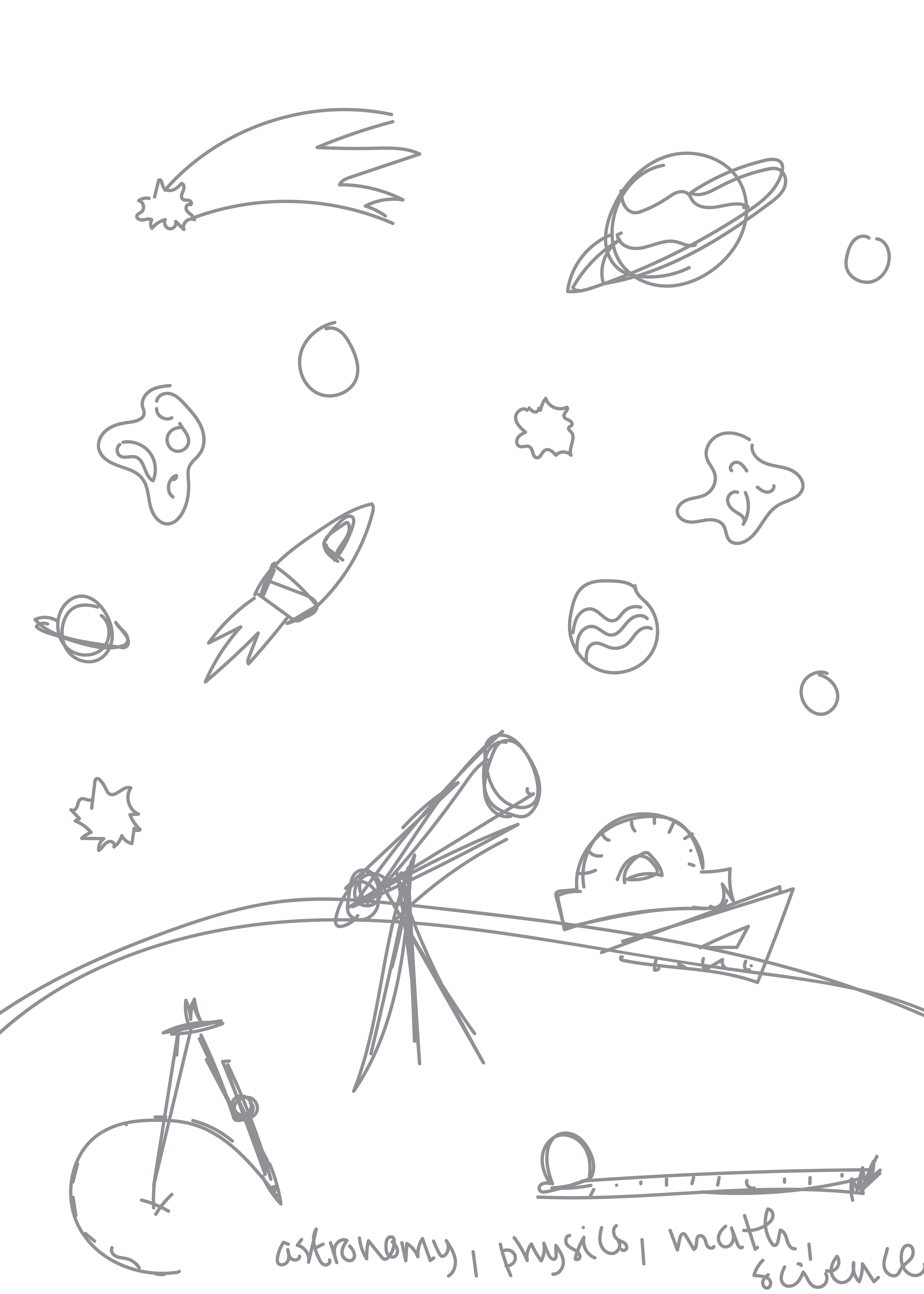
Poster 5 sketch
Poster 5
Final Outcome
Favorite Details
A favorite element, apart from the overall illustration style, is the usage of typography. The two typefaces, a bold yet equally serene serif font paired with a light capitalized font in smaller point size, create this harmony between the illustration and the message, as well as between the poster and the viewer.
Lessons Learned
This project taught me to trust the process and not rush my work. This project generally took longer than expected but the time was necessary in order to produce this harmony between the posters, and the feelings depicted through each one.
Future Paths
If the opportunity presents itself, I would love to design posters for book fairs, or even submit modified versions of these designs for use in their advertising, as I closely associate to both the creative process of reimagining scenery and the world of books.